
Customising Wedding Stationery, Uncategorized, Wedding Colour Schemes, Wedding Planning, Wedding Stationery
Shatter the Norm: Electrifying Secrets to Choosing Wedding Colour Schemes That Will Leave Your Guests Speechless!
Feb
Wedding Colour Schemes
Introduction: Hey there, future newlyweds! It’s Andy here from Yorkshire Wedding Invites, ready to take you on a colourful journey through the world of wedding stationery. Choosing a colour scheme for your big day can feel like trying to find a needle in a haystack—except the haystack is also rainbow-coloured. Fear not! We’re here to make this process a breeze, ensuring your wedding day is as vibrant (or elegantly subdued) as you’ve always dreamed. So, grab a cuppa, and let’s dive into the kaleidoscope of choosing your perfect wedding colour schemes.
#ChoosingYourColours #WeddingStationeryMagic #YorkshireWeddingInvites
The Colour Wheel of Fortune:
Embarking on the journey to select your wedding colour scheme might seem daunting, but fear not, for the colour wheel is your guiding light in this chromatic adventure. Beyond mere complementary and analogous combinations, the colour wheel unveils a spectrum of possibilities. Imagine a sunset-inspired palette with warm oranges, pinks, and purples, or a serene beachfront ceremony accented with various shades of blue and sandy neutrals. The trick is not just to pick colours but to weave a story that resonates with your personal journey. Delve into the psychology of colours—where blues evoke tranquillity and reds spark passion—and let your chosen hues reflect the essence of your love story.
#ColourWheelMagic #StorytellingWithColours #WeddingHuesThatSpeak
Trends vs Timeless:
In the ever-evolving tableau of wedding trends, the allure of the latest colour fads can be tempting. Yet, the quest for the perfect wedding colour scheme transcends the boundaries of time. Consider the rich, jewel tones that lend a regal aura to any event, or the understated elegance of pastel palettes that whisper tales of timeless romance. When contemplating the balance between contemporary chic and classic elegance, think about how your chosen colours will look in your wedding album decades down the line. Will they capture the zeitgeist of your era or embody a love that’s eternal? It’s not just about colours but about capturing moments and memories that last forever.
#TimelessTrends #ChicAndEternal #MemoriesInColour
Seasons Speak:
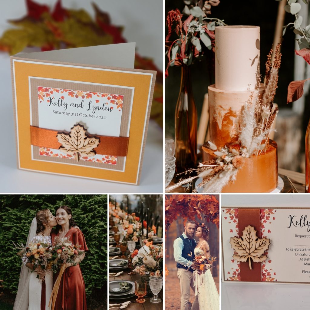
The season of your wedding can be a muse for your colour palette. Each season narrates its own colour story: the fresh, budding greens of spring; the vibrant, saturated hues of summer; the rich, warm tones of autumn; and the stark, ethereal contrasts of winter. These seasonal palettes are nature’s backdrop to your wedding day. Imagine spring’s soft pastels echoing the gentle rebirth of nature, or autumn’s palette painting your day with the fiery, warm tones of falling leaves. Let the season inspire your wedding colour schemes, creating a harmonious symphony between your celebration and the natural world.
#SeasonalSymphony #NatureInspiredWeddings #SeasonalColourMuse
Venue Vibes:
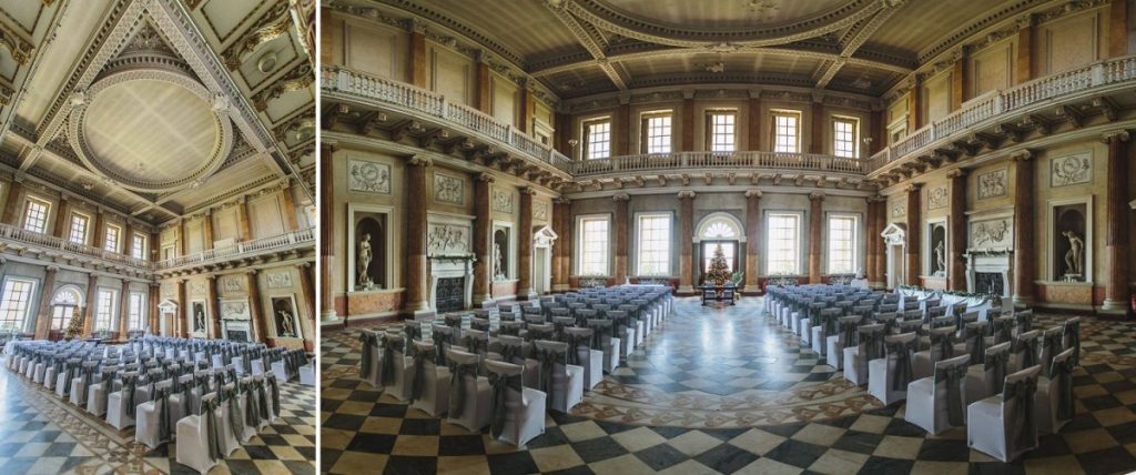
The venue you select is more than just a location; it’s the canvas upon which your wedding day story will be painted. Its colours, textures, and overall ambiance are crucial in choosing your wedding stationery’s colour scheme. A historic castle might call for a palette of deep, rich colours to match its stony walls and regal atmosphere, while a beachside venue opens the door to airy blues, sandy beiges, and coral pinks. Consider how the lighting at your venue—be it the soft glow of candlelight or the bright sunshine of an outdoor setting—will interact with your chosen colours to create the perfect atmosphere for your day.
#VenueAsCanvas #ColourfulVenues #WeddingDayMasterpiece
Personal Flair:
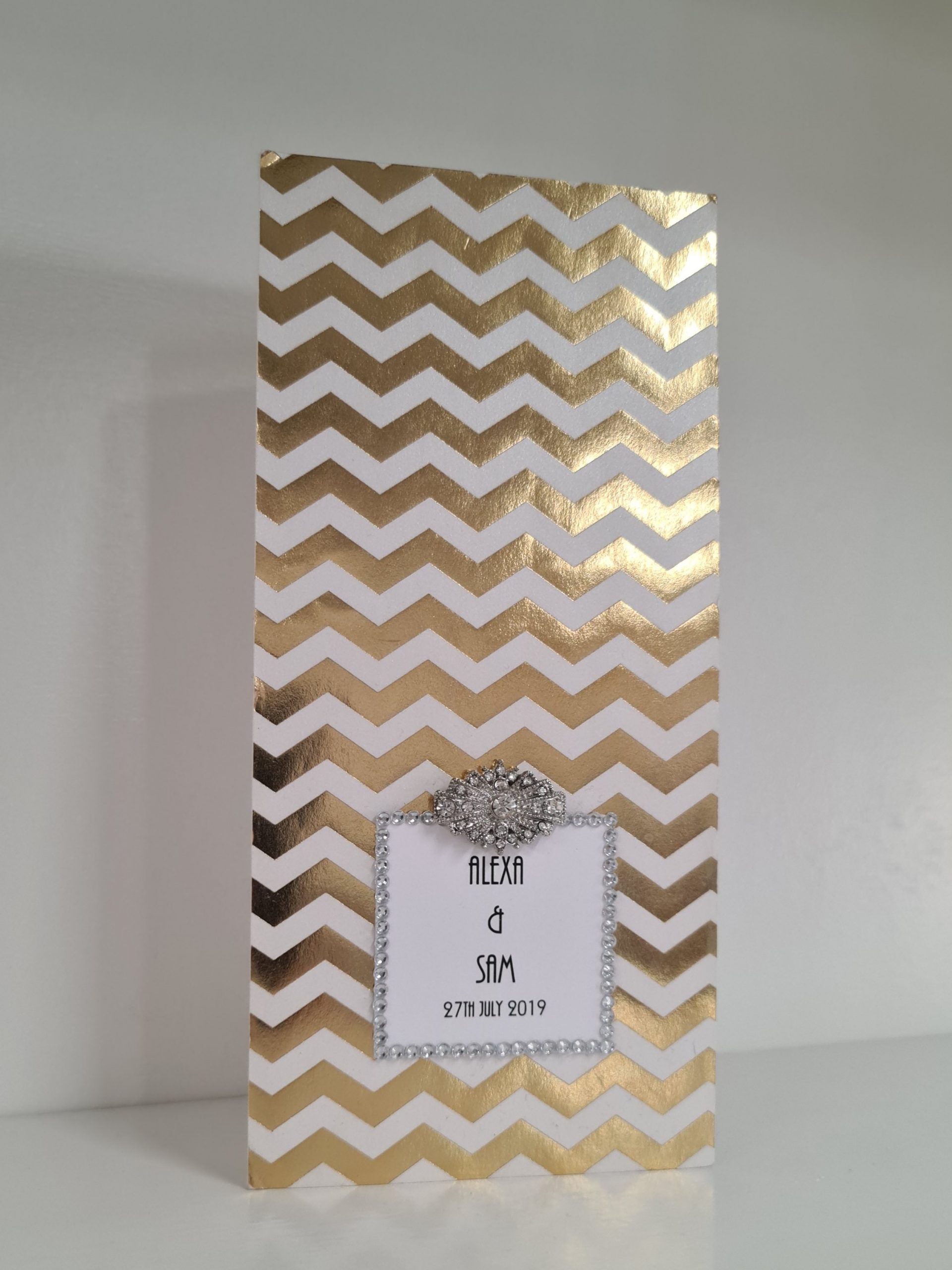
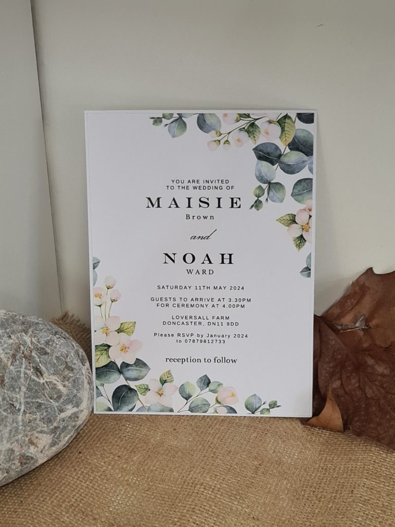
At the heart of your wedding colour scheme decision should be a reflection of you and your partner’s personalities and love story. Whether it’s a shared love for the boldness of art deco black and gold or a mutual appreciation for the tranquillity of ocean blues, your personal flair is what will make your wedding uniquely yours. Don’t shy away from unconventional choices if they speak to you; perhaps a vibrant neon accent against a minimalist palette or a surprising splash of metallics. Your wedding is a celebration of your journey together; let your colour scheme be a testament to your individuality and shared experiences.
#UniqueLoveColours #PersonalFlairPalette #OurLoveOurColours
With your brand’s voice being informative, fun, and relaxed in mind, let’s dive into crafting a blog post that encapsulates all of these elements while focusing on “How do I choose a colour scheme for my wedding stationery?”.
Title: “Unveil the Magic: Picking Your Perfect Wedding Colour Schemes Without Losing Your Marbles!”
Meta Description: “Discover how to choose your wedding colour schemes with ease! Dive into our guide full of tips, trends, and tales to make your wedding stationery truly yours. #WeddingInspiration #ColourSchemes”
Introduction: Hey there, future newlyweds! It’s Andy here from Yorkshire Wedding Invites, ready to take you on a colourful journey through the world of wedding stationery. Choosing a colour scheme for your big day can feel like trying to find a needle in a haystack—except the haystack is also rainbow-coloured. Fear not! We’re here to make this process a breeze, ensuring your wedding day is as vibrant (or elegantly subdued) as you’ve always dreamed. So, grab a cuppa, and let’s dive into the kaleidoscope of choosing your perfect wedding colour schemes.
#ChoosingYourColours #WeddingStationeryMagic #YorkshireWeddingInvites
The Colour Wheel of Fortune: Before you spin the wheel, let’s talk basics. The colour wheel isn’t just for art students; it’s your best friend in the quest for the perfect wedding colour schemes. Complementary colours? Check. Analogous harmony? Double-check. This isn’t about going back to school, though; it’s about finding what speaks to you. Remember, your wedding, your rules!
Check out this link to download a colour chart (curtsey of http://www.graphicsport.com)
Trends vs Timeless: While we’re all for trendy hues (hello, Pantone Colour of the Year), there’s something to be said for timeless elegance. Whether you’re leaning towards something that screams “now” or a palette that whispers “forever,” the key is consistency across your wedding stationery. Let’s find that sweet spot between fleeting fads and eternal elegance.
#TrendyOrTimeless #WeddingTrends #EternalElegance
Seasons Speak: Your wedding season is not just a date on the calendar; it’s a palette waiting to be discovered. A winter wonderland wedding? Think crisp whites and icy blues. A summer soiree? How about vibrant yellows and lush greens. Let the time of year guide your palette, and your wedding will feel like it’s in perfect harmony with the world around it.
#SeasonalPalette #SummerWeddings #WinterWonderlands
If you require any help combining your coulours into your stationery please let us help https://yorkshireinvites.co.uk/product-category/wedding-event-stationery/
Venue Vibes: Consider your venue’s colour scheme and architectural style—it’s like the canvas for your wedding day masterpiece. A rustic barn calls for different hues than a sleek city loft. Your wedding stationery should give your guests a sneak peek of the celebration to come, matching the venue’s vibe in every shade.
#VenueInspired #MatchYourVenue #WeddingVibes
Personal Flair: Ultimately, your wedding is a reflection of you and your partner’s personalities. Love bold, unconventional colours? Go for it. Prefer soft, romantic pastels? Perfect. This is your day to shine, so let your personal taste lead the way in choosing your wedding colour schemes.
#BeUniquelyYou #PersonalPalette #LoveInColour
Conclusion: Choosing the perfect wedding colour schemes might seem daunting, but remember, it’s all about what makes you smile. Whether you’re drawn to the classics or ready to set trends, your wedding stationery is the first brushstroke in the masterpiece that is your wedding day. So, take a deep breath, trust your gut, and let your love story paint the way. Need a hand bringing your vision to life? Yorkshire Wedding Invites is just a call away—ready to turn your dreams into reality, one colour at a time.
#DreamInColour #WeddingStationeryExperts #YorkshireWeddings
List of Sources:
- “The Color Scheme Bible” by Anna Starmer: A comprehensive guide to working with colours, offering insights into colour combinations and psychological effects.
- “Pantone’s Guide to Communicating with Color” by Leatrice Eiseman: Provides an in-depth look at how colours can influence mood and perception, useful for understanding the impact of wedding colour schemes.
- The Knot: An online wedding planning resource that offers yearly insights into wedding trends, including colour schemes.
- Style Me Pretty: A wedding inspiration website that showcases real weddings and the latest in wedding colour trends.
- Psychology of Color: A field of study within psychology that looks into how colours affect human behavior and emotions, relevant for understanding how wedding colours can influence the atmosphere of your celebration.